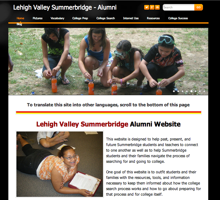
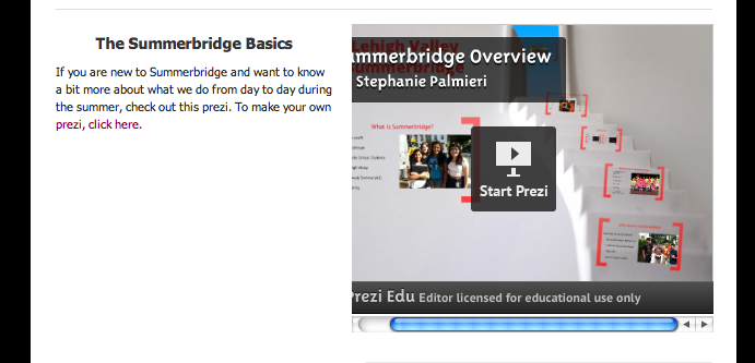
Content: The content on this page is specifically designed to give a complete overview of the program so that users know what the site holds for them. Because this website is designed for the use of Summerbridge students, and is introduced in the summer when students can work directly on the site with teacher assistance, the home screen is long and has a lot of different parts. When students come back to the site on their leisure time, I want them to be able to find exactly what they need.
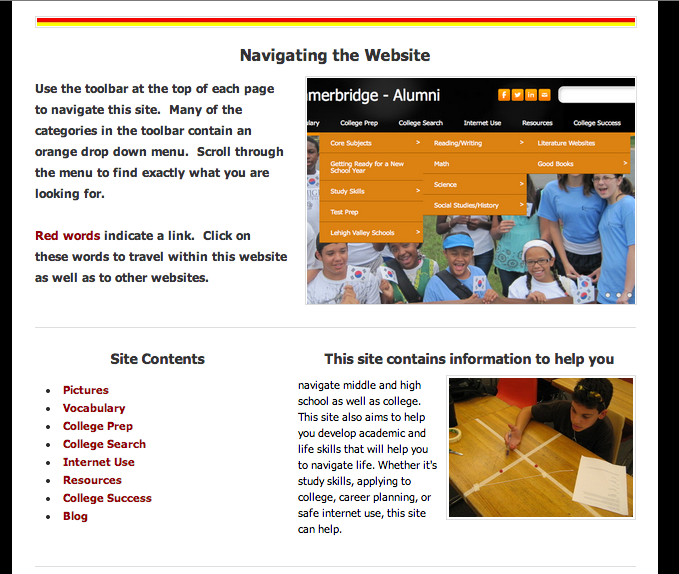
Organization: I used columns to keep the information organized. I felt this set up was the best way to keep the user from getting overwhelmed.
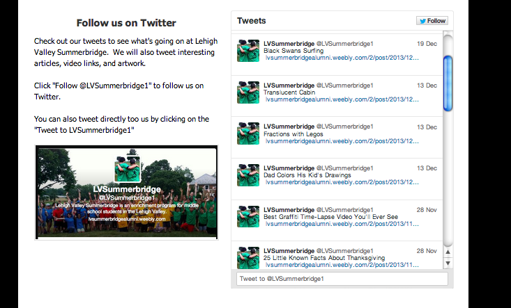
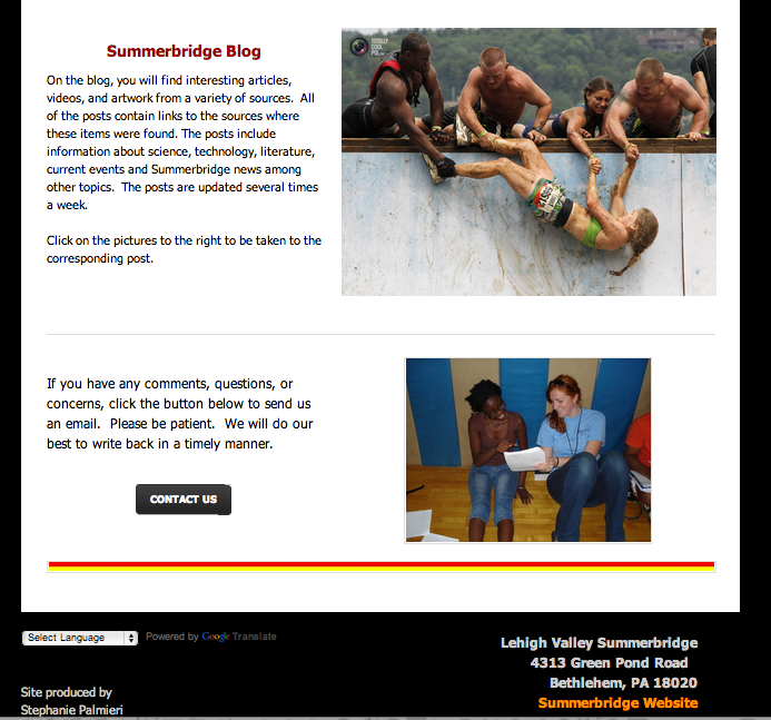
Images: I wanted to show the students having fun while learning, and the teachers (included in header slideshow). I also wanted to show users how the site works in terms of navigation, and I wanted to make sure students make it to the blog. I have uploaded a number of images from the different stories I have posted on the blog. Each image in the slideshow is linked so students can be taken directly to the post if the image intrigues them.
Color: I chose a black screen background with white page background. The black border focuses the eye on the central content. Summerbridge logo colors are red and yellow. I incorporated those colors into some of the divider images. I also chose to make one of the site accent colors orange to fit in with the warm colors.
Font: I kept the font consistent throughout. I used bold and size changes to highlight certain content. I chose to use black font because it has a nice contrast against the white backdrop. I also went with a size 16 font (in Weebly) in order to make the content legible.
Organization: I used columns to keep the information organized. I felt this set up was the best way to keep the user from getting overwhelmed.
Images: I wanted to show the students having fun while learning, and the teachers (included in header slideshow). I also wanted to show users how the site works in terms of navigation, and I wanted to make sure students make it to the blog. I have uploaded a number of images from the different stories I have posted on the blog. Each image in the slideshow is linked so students can be taken directly to the post if the image intrigues them.
Color: I chose a black screen background with white page background. The black border focuses the eye on the central content. Summerbridge logo colors are red and yellow. I incorporated those colors into some of the divider images. I also chose to make one of the site accent colors orange to fit in with the warm colors.
Font: I kept the font consistent throughout. I used bold and size changes to highlight certain content. I chose to use black font because it has a nice contrast against the white backdrop. I also went with a size 16 font (in Weebly) in order to make the content legible.
